ggplot#
New in version 0.7:
pip install jupysql --upgrade
Note
ggplot API requires matplotlib: pip install matplotlib
The ggplot API is structured around the principles of the grammar of graphics, and allows you to build any graph using the same components: a data set, a coordinate system, and geoms (geometric objects).
To make it suitble for JupySQL, specifically for the purpose of running SQL and plotting larger-than-memory datasets on any laptop, we made a small modification from the original ggplot2 API. Rather than providing a dataset, we now provide a SQL table name.
Other than that, at this point we support:
Aes:
x- a SQL column mappingcolorandfillto apply edgecolor and fill colors to plot shapes
Geoms:
geom_boxplotgeom_histogram
Facet:
facet_wrapto display multiple plots in 1 layout
Please note that each geom has its own unique attributes, e.g: number of bins in geom_histogram. We’ll cover all the possible parameters in this tutorial.
Building a graph#
To build a graph, we first should initialize a ggplot instance with a reference to our SQL table using the table parameter, and a mapping object.
Here’s is the complete template to build any graph.
(
    ggplot(table='sql_table_name', mapping=aes(x='table_column_name'))
    +
    geom_func() # geom_histogram or geom_boxplot (required)
    +
    facet_func() # facet_wrap (optional)
)
Note
Please note this is the 1st release of ggplot API. We highly encourage you to provide us with your feedback through our Slack channel to assist us in improving the API and addressing any issues as soon as possible.
Examples#
First, establish the connection, import necessary functions and prepare the data.
Setup#
%load_ext sql
%sql duckdb://
Show code cell output
from sql.ggplot import ggplot, aes, geom_boxplot, geom_histogram, facet_wrap
from pathlib import Path
from urllib.request import urlretrieve

url = "https://d37ci6vzurychx.cloudfront.net/trip-data/yellow_tripdata_2021-01.parquet"

if not Path("yellow_tripdata_2021-01.parquet").is_file():
    urlretrieve(url, "yellow_tripdata_2021-01.parquet")
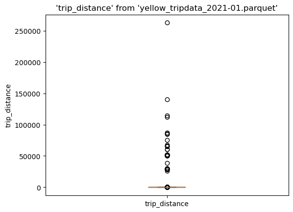
Boxplot#
(ggplot("yellow_tripdata_2021-01.parquet", aes(x="trip_distance")) + geom_boxplot())
<sql.ggplot.ggplot.ggplot at 0x7f731a317a90>
Histogram#
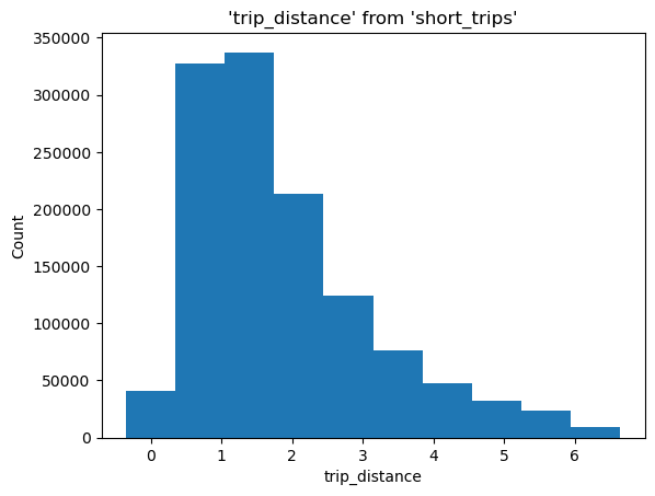
To make it more interesting, let’s create a query that filters by the 90th percentile. Note that we’re using the --save, and --no-execute functions. This tells JupySQL to store the query, but skips execution. We’ll reference it in our next plotting calls using the with_ parameter.
%%sql --save short_trips --no-execute
select * from 'yellow_tripdata_2021-01.parquet'
WHERE trip_distance < 6.3
(
    ggplot(table="short_trips", with_="short_trips", mapping=aes(x="trip_distance"))
    + geom_histogram(bins=10)
)
<sql.ggplot.ggplot.ggplot at 0x7f7308471b40>
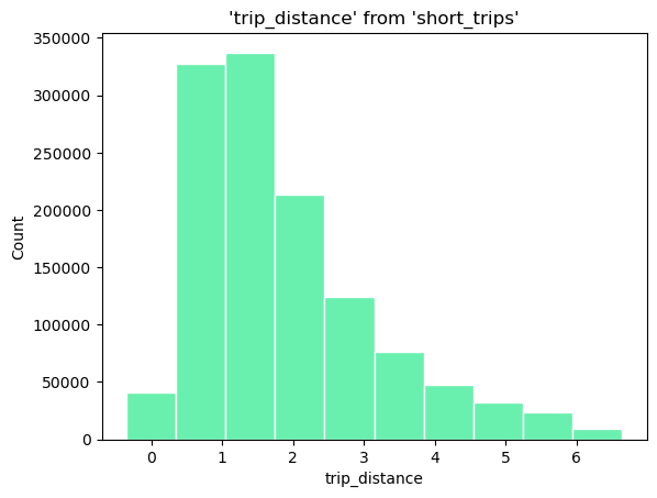
Custom Style#
By modifying the fill and color attributes, we can apply our custom style
(
    ggplot(
        table="short_trips",
        with_="short_trips",
        mapping=aes(x="trip_distance", fill="#69f0ae", color="#fff"),
    )
    + geom_histogram(bins=10)
)
<sql.ggplot.ggplot.ggplot at 0x7f72e0b79f30>
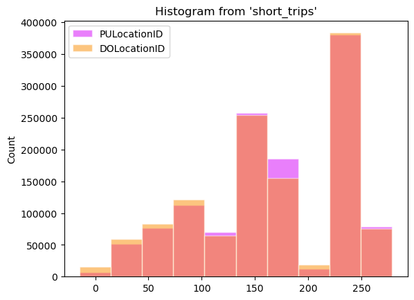
When using multiple columns we can apply color on each column
(
    ggplot(
        table="short_trips",
        with_="short_trips",
        mapping=aes(
            x=["PULocationID", "DOLocationID"],
            fill=["#d500f9", "#fb8c00"],
            color="white",
        ),
    )
    + geom_histogram(bins=10)
)
<sql.ggplot.ggplot.ggplot at 0x7f72d6fd6860>
Categorical histogram#
To make it easier to demonstrate, let’s use ggplot2 diamonds dataset.
from pathlib import Path
from urllib.request import urlretrieve

if not Path("diamonds.csv").is_file():
    urlretrieve(
        "https://raw.githubusercontent.com/tidyverse/ggplot2/main/data-raw/diamonds.csv",  # noqa
        "diamonds.csv",
    )
%%sql
CREATE TABLE diamonds AS SELECT * FROM diamonds.csv
| Count |
|---|
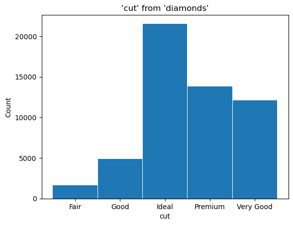
Now, let’s create a histogram of the different cuts of the diamonds by setting x='cut'.
Please note, since the values of cut are strings, we don’t need the bins attribute here.
(ggplot("diamonds", aes(x="cut")) + geom_histogram())
<sql.ggplot.ggplot.ggplot at 0x7f72d6666050>
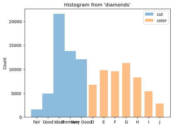
We can show a histogram of multiple columns by setting x=['cut', 'color']
(ggplot("diamonds", aes(x=["cut", "color"])) + geom_histogram())
<sql.ggplot.ggplot.ggplot at 0x7f72d6667400>
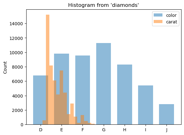
We can also plot histograms for a combination of categorical and numerical columns.
(ggplot("diamonds", aes(x=["color", "carat"])) + geom_histogram(bins=30))
<sql.ggplot.ggplot.ggplot at 0x7f72d6f9ba90>
Apply a custom color with color and fill
(
    ggplot("diamonds", aes(x="price", fill="green", color="white"))
    + geom_histogram(bins=10, fill="cut")
)
<sql.ggplot.ggplot.ggplot at 0x7f72d71e0b50>
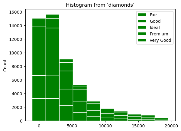
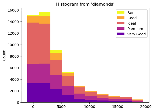
If we map the fill attribute to a different variable such as cut, the bars will stack automatically. Each colored rectangle on the stacked bars will represent a unique combination of price and cut.
(ggplot("diamonds", aes(x="price")) + geom_histogram(bins=10, fill="cut"))
<sql.ggplot.ggplot.ggplot at 0x7f72d66647f0>
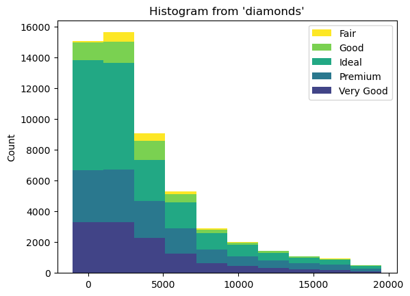
We can apply a different coloring using cmap
(
    ggplot("diamonds", aes(x="price"))
    + geom_histogram(bins=10, fill="cut", cmap="plasma")
)
<sql.ggplot.ggplot.ggplot at 0x7f72d6c4c2b0>
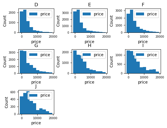
Facet wrap#
facet_wrap() arranges a sequence of panels into a 2D grid, which is beneficial when dealing with a single variable that has multiple levels, and you want to arrange the plots in a more space efficient manner.
Let’s see an example of how we can arrange the diamonds price histogram for each different color
(ggplot("diamonds", aes(x="price")) + geom_histogram(bins=10) + facet_wrap("color"))
<sql.ggplot.ggplot.ggplot at 0x7f72d7662d40>
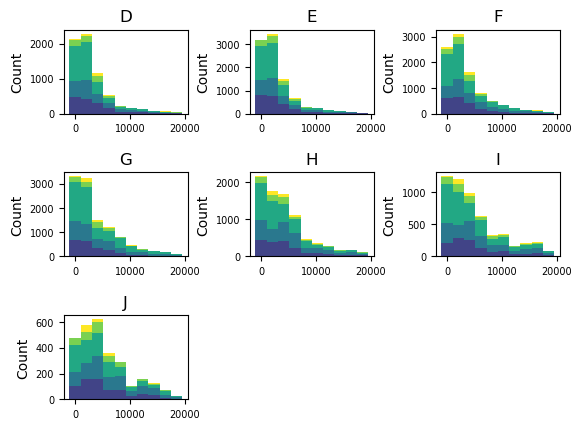
We can even examine the stacked histogram of price by cut, for each different color.
Let’s also hide legend with legend=False to see each plot clearly.
(
    ggplot("diamonds", aes(x="price"))
    + geom_histogram(bins=10, fill="cut")
    + facet_wrap("color", legend=False)
)
<sql.ggplot.ggplot.ggplot at 0x7f72d7660400>